Logo design for Plays Like A Girl blog
What and why?
This was a project built for the purpose of creating a logo and headline for the blog Plays Like a Girl. The focus of the blog was on games from a woman's perspective.
What was learned
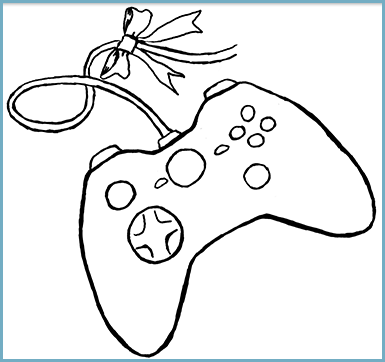
In this case, it was a matter of thinking about the balance of the logo with the header font choice. I went with a blockier Courier style font, but wanted something sketchier and more welcoming in the logo. The bow of course signifies femininity, and the game controller needed more depth to contrast the flat font.

This is how the first logo started out. It was sketchy, and rough, but had the basics down.

The full header required the title and subtitle of the blog, which were set in a more flat type-writer style font.

This was the final logo iteration. The round and sketchy elements of the logo felt better in comparison with the font.